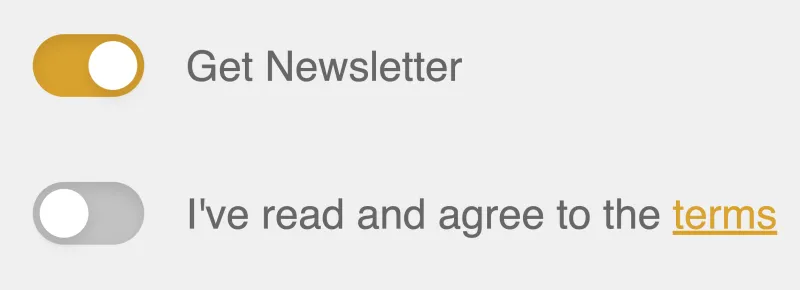
Custom toggle switches are a pain to code from scratch. So many lines for such a simple UI widget! In this quick tutorial, we will learn how to build a fully encapsulated toggle switch component in Vue.js. The component we’re building is used currently on boot.dev’s login page. Go take a look to see a live demo.
The HTML Template 🔗
<template>
  <div>
    <span
      class="toggle-wrapper"
      role="checkbox"
      :aria-checked="value.toString()"
      tabindex="0"
      @click="toggle"
      @keydown.space.prevent="toggle"
    >
      <span
        class="toggle-background"
        :class="backgroundStyles"
      />
      <span
        class="toggle-indicator"
        :style="indicatorStyles"
      />
    </span>
  </div>
</template>
The toggle-wrapper is what it sounds like, the parent div for our component. The toggle-background will be the pill-shaped oval and the toggle-indicator is the circle that we will animate to move back and forth.
The JavaScript 🔗
export default {
  props: {
    value:{
      type: Boolean,
      required: true
    }
  },
  computed: {
    backgroundStyles() {
      return {
        'gold-mid': this.value,
        'gray-lighter': !this.value
      };
    },
    indicatorStyles() {
      return { transform: this.value ? 'translateX(14px)' : 'translateX(0)' };
    }
  },
  methods: {
    toggle() {
      this.$emit('input', !this.value);
    }
  }
};
We have setup the component such that the user of the component can use the v-model attribute to get/set the current state of the switch. We have setup the backgroundStyles and indicatorStyles to dynamically change some CSS for us as the state updates.
The CSS 🔗
.gold-mid{
  background-color: #666666;
}

.gray-lighter{
  background-color: #c2c2c2;
}

.toggle-wrapper {
  display: inline-block;
  position: relative;
  cursor: pointer;
  width: 32px;
  height: 18px;
  border-radius: 9999px;
}

.toggle-wrapper:focus {
  outline: 0;
}

.toggle-background {
  display: inline-block;
  border-radius: 9999px;
  height: 100%;
  width: 100%;
  box-shadow: inset 0 2px 4px rgba(0, 0, 0, 0.1);
  transition: background-color .4s ease;
}

.toggle-indicator {
  position: absolute;
  height: 14px;
  width: 14px;
  left: 2px;
  bottom: 2px;
  background-color: #ffffff;
  border-radius: 9999px;
  box-shadow:  0 2px 4px rgba(0, 0, 0, 0.1);
  transition: transform .4s ease;
}
The only particularly interesting thing going on here is the fade in/out of the gold color on the background and the movement of the toggle-indicator. Both of these are accomplished with the transition CSS attribute.
Hopefully this saves you some time building out one of the more common UI/UX components in Vue! It’s the small things like this that give applications the professional flourish that keep users engaged. Be sure to reach out to me directly with feedback or questions!