You have a problem. The browser’s default checkbox form is ugly and outdated, but importing an entire library just to change the styling seems like overkill. Instead, let’s build a custom checkbox form component from scratch. It will take 15 minutes to type up, or just 3 if you just copy and paste my boilerplate code.
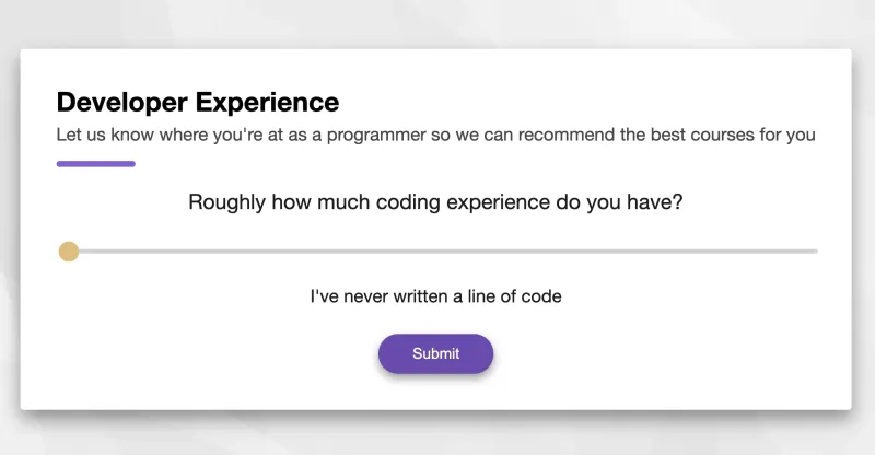
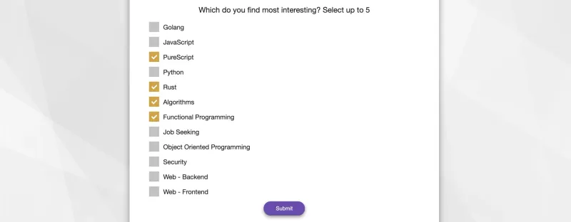
Before we dive into how it works, you can see a live demo here, or you can see how we are using it in production on the signup flow of boot.dev’s coding courses platform.
The HTML 🔗
<template>
  <div>
    <div class="checkbox-form">
      <div class="answers">
        <label
          v-for="(option, i) of options"
          :key="i"
          class="item"
        >
          <span :for="option">{{ option }}</span>
          <input
            :id="option"
            v-model="checked"
            type="checkbox"
            :value="option"
            @change="onChange"
          >
          <span class="checkmark" />
        </label>
      </div>
    </div>
  </div>
</template>
As you can see, the important thing here is that we are creating an input and span element for each option provided in the component’s props. We’ll styling these and add functionality in the next steps.
The JavaScript 🔗
export default {
  props: {
    options: {
      type: Array,
      required: false,
      default: () => []
    }
  },
  data(){
    return {
      checked: []
    };
  },
  methods: {
    onChange() {
      this.$emit('input', this.checked);
    }
  }
};
We only require one prop: options, which represent all of the options available to the user. As boxes are checked, we add them to the checked state variable, and each time that variable changes we emit it so that the parent can stay reactive.
The CSS 🔗
.checkbox-form {
	display: flex;
	flex-direction: column;
	align-items: center;
}

.checkbox-form .answers {
	display: flex;
	flex-direction: column;
	align-items: left;
	width: 100%;
}

.checkbox-form label {
	margin-left: 1em;
}

.checkbox-form .item {
	display: block;
	position: relative;
	padding-left: 35px;
	margin-bottom: 12px;
	cursor: pointer;
	font-size: 1em;
	height: 25px;
	-webkit-user-select: none;
	-moz-user-select: none;
	-ms-user-select: none;
	user-select: none;
	display: flex;
	align-items: center;
}

.checkbox-form .item input {
	position: absolute;
	opacity: 0;
	cursor: pointer;
	height: 0;
	width: 0;
}

.checkbox-form .checkmark {
	position: absolute;
	top: 0;
	left: 0;
	height: 25px;
	width: 25px;
	background-color: #c2c2c2;
}

.checkbox-form .item:hover input ~ .checkmark {
	background-color: #949494;
}

.checkbox-form .item input:checked ~ .checkmark {
	background-color: #D8A22E;
}

.checkbox-form .checkmark:after {
	content: "";
	position: absolute;
	display: none;
}

.checkbox-form .item input:checked ~ .checkmark:after {
	display: block;
}

.checkbox-form .item .checkmark:after {
	left: 9px;
	top: 5px;
	width: 5px;
	height: 10px;
	border: solid white;
	border-width: 0 3px 3px 0;
	-webkit-transform: rotate(45deg);
	-ms-transform: rotate(45deg);
	transform: rotate(45deg);
}
Nothing too crazy is happening here, but the main takeaway is that we’re hiding the default input completely and styling our span element to be the actual checkmark.
Putting it All Together 🔗
<template>
  <div>
    <div class="checkbox-form">
      <div class="answers">
        <label
          v-for="(option, i) of options"
          :key="i"
          class="item"
        >
          <span :for="option">{{ option }}</span>
          <input
            :id="option"
            v-model="checked"
            type="checkbox"
            :value="option"
            @change="onChange"
          >
          <span class="checkmark" />
        </label>
      </div>
    </div>
  </div>
</template>

<script>
export default {
  props: {
    options: {
      type: Array,
      required: false,
      default: () => []
    }
  },
  data(){
    return {
      checked: []
    };
  },
  methods: {
    onChange() {
      this.$emit('input', this.checked);
    }
  }
};
</script>

<style scoped>
.checkbox-form {
	display: flex;
	flex-direction: column;
	align-items: center;
}

.checkbox-form .answers {
	display: flex;
	flex-direction: column;
	align-items: left;
	width: 100%;
}

.checkbox-form label {
	margin-left: 1em;
}

.checkbox-form .item {
	display: block;
	position: relative;
	padding-left: 35px;
	margin-bottom: 12px;
	cursor: pointer;
	font-size: 1em;
	height: 25px;
	-webkit-user-select: none;
	-moz-user-select: none;
	-ms-user-select: none;
	user-select: none;
	display: flex;
	align-items: center;
}

.checkbox-form .item input {
	position: absolute;
	opacity: 0;
	cursor: pointer;
	height: 0;
	width: 0;
}

.checkbox-form .checkmark {
	position: absolute;
	top: 0;
	left: 0;
	height: 25px;
	width: 25px;
	background-color: #c2c2c2;
}

.checkbox-form .item:hover input ~ .checkmark {
	background-color: #949494;
}

.checkbox-form .item input:checked ~ .checkmark {
	background-color: #D8A22E;
}

.checkbox-form .checkmark:after {
	content: "";
	position: absolute;
	display: none;
}

.checkbox-form .item input:checked ~ .checkmark:after {
	display: block;
}

.checkbox-form .item .checkmark:after {
	left: 9px;
	top: 5px;
	width: 5px;
	height: 10px;
	border: solid white;
	border-width: 0 3px 3px 0;
	-webkit-transform: rotate(45deg);
	-ms-transform: rotate(45deg);
	transform: rotate(45deg);
}
</style>