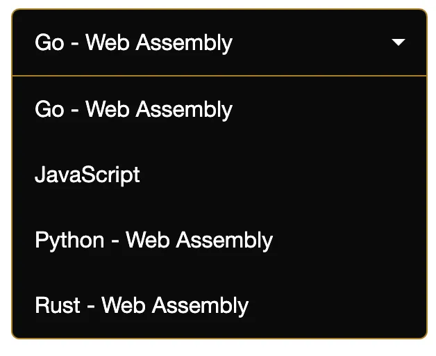
Creating a custom select tag with its own styling is notoriously difficult. Sometimes it’s impossible to build from scratch without a combination of styled divs and custom JavaScript. In this article, you’ll learn how to create a custom select component in Vue that can be easily styled with your own CSS. In fact, it’s the same component we use in production on boot.dev, and you can see it in action on our JavaScript playground.
Code Sandbox Demo 🔗
The HTML 🔗
<template>
  <div class="custom-select" :tabindex="tabindex" @blur="open = false">
    <div class="selected" :class="{ open: open }" @click="open = !open">
      {{ selected }}
    </div>
    <div class="items" :class="{ selectHide: !open }">
      <div
        v-for="(option, i) of options"
        :key="i"
        @click="
          selected = option;
          open = false;
          $emit('input', option);
        "
      >
        {{ option }}
      </div>
    </div>
  </div>
</template>
The following is important to note:
- The tabindex property allows our component to be focused, which in turn allows it to be blurred. The blur event closes our component when a user clicks outside of the component.
- By emitting the selected option using the ‘input’ parameter, the parent component can react to changes.
The JavaScript 🔗
<script>
export default {
  props: {
    options: {
      type: Array,
      required: true,
    },
    default: {
      type: String,
      required: false,
      default: null,
    },
    tabindex: {
      type: Number,
      required: false,
      default: 0,
    },
  },
  data() {
    return {
      selected: this.default
        ? this.default
        : this.options.length > 0
        ? this.options[0]
        : null,
      open: false,
    };
  },
  mounted() {
    this.$emit("input", this.selected);
  },
};
</script>
Important things to note about the JavaScript:
- We also emit the selected value on mount so that the parent doesn’t need to set the default value explicitly.
- If our select component is a small part of a larger form, then we want to be able to set the correct tabindex.
The CSS 🔗
<style scoped>

.custom-select {
  position: relative;
  width: 100%;
  text-align: left;
  outline: none;
  height: 47px;
  line-height: 47px;
}

.custom-select .selected {
  background-color: #0a0a0a;
  border-radius: 6px;
  border: 1px solid #666666;
  color: #fff;
  padding-left: 1em;
  cursor: pointer;
  user-select: none;
}

.custom-select .selected.open {
  border: 1px solid #ad8225;
  border-radius: 6px 6px 0px 0px;
}

.custom-select .selected:after {
  position: absolute;
  content: "";
  top: 22px;
  right: 1em;
  width: 0;
  height: 0;
  border: 5px solid transparent;
  border-color: #fff transparent transparent transparent;
}

.custom-select .items {
  color: #fff;
  border-radius: 0px 0px 6px 6px;
  overflow: hidden;
  border-right: 1px solid #ad8225;
  border-left: 1px solid #ad8225;
  border-bottom: 1px solid #ad8225;
  position: absolute;
  background-color: #0a0a0a;
  left: 0;
  right: 0;
  z-index: 1;
}

.custom-select .items div {
  color: #fff;
  padding-left: 1em;
  cursor: pointer;
  user-select: none;
}

.custom-select .items div:hover {
  background-color: #ad8225;
}

.selectHide {
  display: none;
}
</style>
This CSS is just an example, it’s what we use in the boot.dev app. Feel free to change the styling to whatever your needs are.
If you put the three sections together in the same file, you will be left with a well-encapsulated custom select single file component! Copying and pasting code gets a bad rep, it’s usually much better than importing libraries, especially for visual components. When you do “steal” code from somewhere, always be sure you understand it!
Try to practice good engineering and computer science principles by encapsulating your components and building well-thought-out APIs. The jobs you will qualify for will be that much better, and you’ll write better code as a result!